Photography – a world of care, compassion and confidence

The sense of dedication is seen in our photography and visual world. The style is honest, clear and focused, without any artificial or overly dramatic elements.

Visual language

No matter what help is needed, we’re there to provide outcome-driven solutions that demonstrate our commitment to care and recovery. This sense of dedication is seen in our photography and visual world. The style is honest, clear and focused, without any artificial or overly dramatic elements. Because real life and genuine results are what matter.

Our photographic inspiration is based on the documentation and editorial style. Our visual language is human- centric: caring, honest, focused, simplified, outcome-driven, smart.

A collage of three images that illustrate the HARTMANN visual language. The collage shows a doctor washing her hands, a father playing with his children and a nurse holding a patient's hands.

Clinical surroundings

Our products bring with them a strong sense of safety, reliability and competence. This is reflected in the mood of the images and how the people interact with their surroundings and with one another.
A collage of several images that illustrate the HARTMANN visual language. Surgeons are shown in different situations of their work.

User & Customer surroundings

We're everywhere life is. We meet people, in all of their personal situations, with innovation built on understanding and trust. We showcase the joy of feeling protected.

Our goal is to always show authentic moments that place the viewer in the middle of the action. These situations can be aspirational as well as challenging. We always place ourselves at eye level with our costumers and focus on the positive.

A collage of several images that illustrate the HARTMANN visual language. Happy seniors and care situations are shown.

Guiding principles in photography

An overview of core principles that make a good photo.
Two examples of images that illustrate the HARTMANN visual language. One picture shows a happy elderly couple and the other shows nursing staff at work in a hospital.
Light & Contrast
pleasant | clear | light | natural | warm
Natural lighting compliments our photo style and is always the first choice. The lighting should reflect the brand and products with a warm “Scandinavian crispness.”

Please avoid:

  • Harsh lights and deep shadows
  • Unnaturally colored lighting and color casts
  • Overly dramatic, mystical lighting, excessive lens flare
  • Clinical clean whites and neutral grey tones
Two examples of images that illustrate the HARTMANN visual language. One picture shows a happy elderly lady on her mobile phone and the other shows a nurse at work in the hospital.
Color
harmonic | warm | appropriate | seamless
Warm lighting sets the stage for a rich color palette. Blue tones are based on the brand colors and create a visual cohesion. While always an option, they are not mandatory in every picture.

Please avoid:

  • Desaturated colors as well as high color contrasts
  • Color casts
Two examples of images that illustrate the HARTMANN visual language. One picture shows a person with a cast on their foot and crutches and the other shows a doctor inspecting medical equipment.
Perspective
immersive | observational | inclusive | flexible | sudden
The photographic style should always give the viewer the feeling of being a part of what they are observing. Unusual perspectives are allowed but must be focused on the intended message is.

Please avoid:

  • Static and arranged angles
  • Overly-dramatic angles that don’t fit the situation
  • Predictable visual axis
Two examples of images that illustrate the HARTMANN visual language. Top picture shoes a father playing with his children and the bottom picture shows a person with a cast on their foot.
Attitude
real authentic | forward-looking | solution-focused

Our goal is to always show authentic moments that place the viewer in the middle of the action. These situations can be aspirational as well as challenging. We always place ourselves at eye level with our customers and focused on the positive.

Please avoid:

  • Passive, uninterested posing
  • Direct gaze into the camera
  • Unrecognizable motion blur
  • Showing pain and fear

Guidance – choices to avoid

 An example of a picture that does not embody the HARTMANN visual language. The picture shows someone in a wheelchair being pushed by a laughing person on a motorway.
Fake situations – find inspiration in the “here & now” because real life tells the best and most relatable stories.
An example of a picture that does not embody the HARTMANN visual language. The picture shows nursing staff hastily pushing a patient in his bed through the hospital corridor.
Overly dramatic – show moments that are centered on our goals of providing care, competence and best outcomes.
An example of a picture that does not embody the HARTMANN visual language. The picture shows three doctors looking directly into the camera.
Passive staging – capture real moments of everyday life with approachable people and their world.
An example of a picture that does not embody the HARTMANN visual language. The picture shows a crying toddler.
Uncomfortable scenes– focus on moments of care, hope, and recovery instead of negative aspects like fear or pain.
An example of a picture that does not embody the HARTMANN visual language. The picture shows nursing staff treating a patient in bed behind a pane of glass.
Excessive distance – immerse the viewer in the scene.
An example of a picture that does not embody the HARTMANN visual language. The picture shows a sterile and cold hospital corridor.
Sterile, cold atmospheres – add a comforting human element to both the surroundings and close-ups.

Cropping title images

A collage of several images showing the way in which images are to be cropped. The top images show how to crop and the bottom images show how not to crop.
Ellipse S
  • Pay attention to the image detail.
  • Leave space for the ellipse and do not disturb it with unimportant details.
A collage of several images showing the way in which images are to be cropped. The top images show how to crop and the bottom images show how not to crop.
Ellipse M
  • Don't lose focus on what matters.
  • Let emotions work, don't crop faces if the story is conveyed through them.

AI Labeling

Images generated by AI must be clearly identified. Depending on the context, image composition, and available space, two approved labeling options are available.

The preferred solution for image labeling is the AI Indicator, as it provides clear identification with a minimal visual footprint. Where additional clarity or explanatory context is required, the AI Generated Label may be used instead.

The labeling should remain clearly recognizable without becoming overly prominent.

  1. AI Indicator
  2. AI Generated Label

AI Indicator

The AI Indicator is the preferred solution for labeling AI-generated images. It is primarily used when space is limited or when the image is displayed in a small format.
Depending on the image composition and contrast, the indicator may be used in black or white at 75% opacity.
The AI Indicator is available for download in multiple language versions in the Downloads section.
AI Generated Label

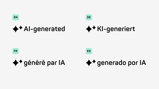
The AI Generated Label combines the AI icon with descriptive text and may be used when additional explanatory context is required.

The label is available in English, German, French, and Spanish. The text is a fixed part of the asset and must not be recreated or typeset separately. Depending on the image composition and contrast, the label may be used in black or white at 75% opacity. The AI Generated Label is available as a downloadable asset in the Downloads section.

See also

For further information, get in touch

HARTMANN Branding Support

Please email us at branding.support@hartmann.info