The use of the HARTMANN primary colors Bright Blue and Dark Blue in combination with Cyan ensures a strong brand presence.
POS excellence made easy with our 3 guiding principles.

1. Blue

2. Emotional
Insert the visual into the Plus – and make it as big as possible.

3. Easy to understand
Direct messaging: a prominent headline delivers our tenet of “outcome first”.
From demand to solution – with message management in 3 simple steps
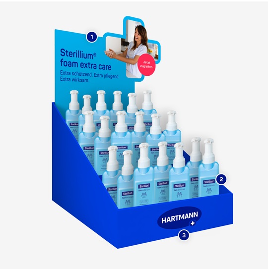
1. See me
IMPACTFUL FROM A DISTANCE Fast and easy recognition of the products and their endorser HARTMANN
2. Choose me
PRODUCT MESSAGE Benefit-driven product presentation
3. Buy me
CALL TO ACTION Try now! NEW
Design guidelines: Use of color
1. Use HARTMANN Cyan as the background color for any Plus-related content.
2. Use HARTMANN Bright Blue for larger parts that are not directly connected to the Plus visuals and for parts that contain the logo.
3. The typography should always be in HARTMANN Dark Blue or white.
Use of the Plus in POS

Stage
The Plus serves as a stage for images, as large as possible.

Image element
Filled with HARTMANN Dark Blue or Cyan if it contains any text.

Design element
- As an outline or filled form
- Listing benefits: use the Plus shape for bullet points
Images
Enlarge images as much as possible, always placed within the campaign Plus. Their role is to support the campaign and convey additional product information on an emotional level.
Logo and ellipse (S or M)

The logo must be used on the ellipse whenever possible and should not be covered or disrupted by other campaign elements. If there is very limited space, the logo can also be placed on a larger asset element in Bright Blue.
At POS we use the logo without the claim.
Eye-catchers at POS
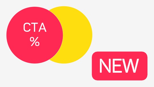
- Use the circular eye-catcher in HARTMANN Red or Yellow if the layout contains another NEW eye-catcher.
- NEW eye-catchers are always used in HARTMANN Red.
Messaging guidelines
Guidelines within the Plus platform
- Image: If possible, use the campaign look for the entire asset and remember: See me – Choose me – Buy me
- Form: There is a higher visibility with extras, e.g., 3D, cut-outs, etc. Make sure the asset is appealing from all sides.
- Sender: Clearly indicate who is talking, ensuring the sender is prominently visible.
Examples of POS designs: Window applications

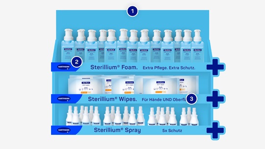
Display for 3 products

Display counter

Wobbler

Shelf stripe for 3 products

See also
For further information please get in touch
HARTMANN Branding Support
Please email us at