Heritage
The HARTMANN Plus is directly derived from the legacy cross used in the Hartmann brand logo and thus acts as a strong connector to the brand’s heritage.

The HARTMANN Plus is directly derived from the legacy cross used in the Hartmann brand logo and thus acts as a strong connector to the brand’s heritage.
We use the Plus as a focused stage for image motifs: introducing, highlighting, and elaborating on product and industry topics to generate attention. At the same time, the Plus combines all elements into a memorable overall impression that is uniquely HARTMANN.
1. Recognition and unification: The Plus symbol serves as a key identifier of the HARTMANN brand across various communication efforts. Its presence unifies the brand’s visual identity and ensures consistent recognition.
2. Prominent yet flexible: The Plus is utilized prominently, yet its flexibility allows for optimal integration with both product and headline elements. This adaptability ensures that the Plus enhances the overall design without hindering the visual flow.
3. Dynamic placement: In alignment with flexibility, the Plus can be positioned to the right, left, or bottom bleed of the layout. This dynamic placement creates visual interest and encourages engagement with the content.
4. Bleeding and inside pages: The Plus is permitted to extend into the bleed area of the layout. This approach creates a sense of expansiveness and modernity in design. On inside pages, bleeding on two sides is also acceptable, maintaining the brand’s contemporary aesthetic.

5. Recognizability and balance:While ensuring flexibility, the Plus must always remain recognizable. No other design elements should be compromised in terms of their prominence or importance. The Plus works in harmony with other visuals, contributing to a balanced and impactful composition.
6. Guiding proportions:When adjusting the Plus’s size, maintain good proportions similar to the provided examples. The aim is to achieve a visually appealing balance that aligns with the brand’s design philosophy.

7. Guiding proportions: When adjusting the Plus’s size, maintain the right proportions akin to the provided examples. The aim is to achieve a visually appealing balance that aligns with the brand’s design philosophy.

The Plus symbol is a versatile and powerful tool for expressing the HARTMANN brand identity across various communication materials.


The Plus element appears in combination with a Headline, a subline (optional), and a number of bullet points. The bullets take on the shape of a smaller Plus and are limited to three bullets for a single composition. All texts are set in Dark Blue.
The Plus as a mask for photos
The Plus serves as a mask for the photo, with part of the image extending beyond the Plus.
The image content can vary in the photos. The guidelines for photography apply here as well. There are always parts of the picture slightly overlapping the plus shape. It should overlap only in the corners and cover a maximum of 2 sides. The overlapping part of the image must not collide with the shown product and eye-catchers.
The Plus as an image element
The Plus can also be used as a graphic form without image content. The color is always HARTMANN Dark Blue.
The Plus as bullet points
Bullet points in Plus communication take the form of a small dark blue plus sign, highlighting key product or service benefits. Ensure each communication item contains no more than three bullet points.

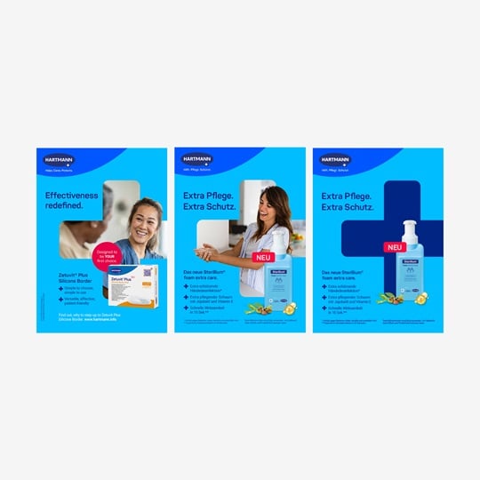
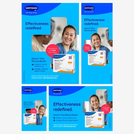

The image motifs used are both descriptive (direct application / impact of the product) and emotional. They tell a story that introduces and explains the product, using fresh, clear colors and depicting likable characters. The visual language never lectures but conveys support and expertise at eye level. The motifs visually express the single most important benefit of the product. In addition to full-body shots, close-ups or images focusing on specific parts of a person or object are also possible.
The image scenarios should align with the specific target groups of the communication (B2B and B2C). However, in individual cases, they can also be placed at a higher level to address more general topics.


Please email us at branding.support@hartmann.info