Basic design principles for the email signature for HARTMANN employees

An email signature is a block of text, images, and links that appears at the end of every email you send.

In addition to your contact information, such as job title, phone number, and email address, you can also use a signature image. The signature image is not mandatory. It should always be targeted, e.g., to draw attention to various topics such as campaigns, product information, or brand cooperation.

Basic design principles for the HARTMANN email signature

Why care about your email signature? An email signature has the potential to be more than just a typical section of information. It’s a medium for conveying messages and promoting campaigns and events, all within the brand's framework.
Schematic representation of fixed and flexible elements in an email signature.


Structure

  1. Personal signature

    The personal signature is defined individually – it includes, among other things, your first and last name along with your position and contact details.

  2. Signature image 

    This is the area where a signature image can be implemented. This is usually similar to an online banner, meaning the content must be kept short and visually clear so it can be quickly grasped by the user. The signature image is not mandatory. It should always be used with purpose.

  3. Email footer 

    HARTMANN’s email footer contains the corporate signature and the disclaimers (in both German and English). It is preset, automatically added to external emails, and cannot be modified.

Colors

Email text and personal signature

The email text itself is always black by default.

The color HARTMANN Dark Blue is used for the personal signature. As an accent color, HARTMANN Bright Blue is used for links (such as website URLs).

Signature image

HARTMANN Light Blue or HARTMANN Dark Blue are used as the main color.

Equally, one of the light shades of HARTMANN Grayscale can be used in specific cases.

Please do not use the 100% value!

Typefaces

Calibri

For email programs – the body text of an email and the personal signature –and office communication (Word, Powerpoint, Excel) use Calibri.

Panton

All text in signature images (incl. buttons that commonly use the Roboto typeface) must use the Panton typeface

Usage of the HARTMANN signature image for marketing purposes

In general

The signature image resembles an online banner. It’s designed to grab a user’s attention quickly. Therefore, make sure your design captures a reader’s short attention span. Keep messages brief and simple and strive for clarity.

Please note that the terms "Campaign signature" and "Signature image" are often used interchangeably. They essentially convey the same idea, although we primarily use the latter term for reference.

Interactivity

You can add a link to any signature image and send readers to a new destination, for example, your campaign landing page. Please note that the link applies to the entire image, not just the button element.

Types

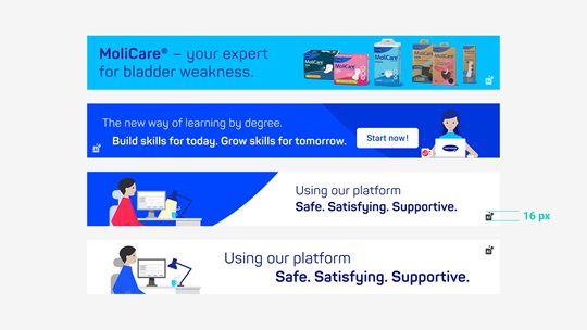
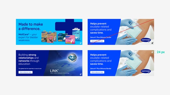
There are two types of signature images: small and large.

Two layout examples for the small signature image with two different visuals, one an illustration, one a photograph.

Small
The small size can contain either an illustration or a photograph.
Implementation example for the large signature image with a photo.

Large
The large size must always contain a photograph. This is used to showcase e.g., campaigns, product information, or brand cooperations.

Imagery

Photography

HARTMANN’s photography is honest, clear, and focused, without any artificial or overly dramatic elements. Ideally, campaign-specific imagery already exists for creating signature images.

Illustrations

Full surface colors without gradients convey clarity, simplicity, and directness. When designing with illustrations, please closely follow the HARTMANN illustration guidelines.

Icons and eye catchers – use sparingly

The boundary between illustration and iconography is fluid. Often it is just about emphasizing a tiny fact – but without disturbing the look or main message. Please use the HARTMANN icon set only.

Find all important information under Design Basics

Especially in the case of the signature image, the appearance of the main content must be considered carefully.

Anatomy of signature image

The signature image comes in two different sizes:
Schematic representation of the small signature image with the dimensions 654 x 87 pixels.

Small signature image
The suffix S = small: 654 × 87 px
Schematic representation of the large signature image with the dimensions 827 x 325 pixels.

Large signature image
The suffix L = large: 827 × 325 px
Layout examples for the small signature image, showing mandatory and optional elements.


Small signature image

The visual content and the text are mandatory elements, while the ellipse and the button are optional.

  1. Text (mandatory)
  2. Picture (photo or illustration, mandatory)
  3. Ellipse (optional)
  4. Call to action button (optional)
Layout example for the large signature image, showing mandatory and optional elements.


Large signature image

The background photograph, the ellipsis, and the text are mandatory elements, while the button is optional.

  1. Ellipse (mandatory)
  2. Picture (photo or illustration, mandatory)
  3. Text (mandatory)
  4. Product branding, reference, or claim (mandatory)
  5. Call to action button (optional)


Please note: The ellipse has a fixed size and position in the given format. It can be colored in either Hartmann Bright Blue or Hartmann Dark Blue.

The opacity of the ellipse must always be 100%.

Please note: Export options

Please export your final signature image as a retina-optimized (@2x) file in PNG or JPG format.
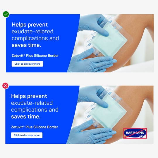
Layout example for the large signature image showing where the HARTMANN logo must not be placed.


Branding

Hartmann

The HARTMANN logo never appears on the signature image – neither the primary nor any other version.

Product or co-branding

The logo of a HARTMANN product brand should be implemented for optimum product communication. 

Co-branding logos may also be shown – for example, to communicate specific HARTMANN services.


Please note: While online banners contain the HARTMANN logo per default, signature images never feature it. This is because in email communication the logo is already contained in the corporate signature.

Examples

Thumbnail display of two complete email signatures, one with a small, one with a large image.


Look and Feel

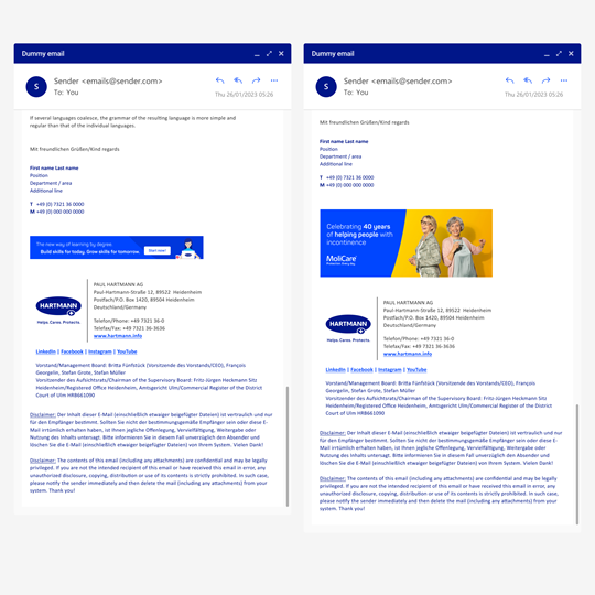
In case of promotions or for marketing purposes, email communication can greatly benefit from signature images, as the examples on the right show.

Here the bold colors work especially well because they emphasize the HARTMANN brand.

Implementation examples for the small signature image, one with an illustration, one with a photograph.


Different visual types

  1. Illustration
  2. Photography
Two layout examples that show what variable branding looks like in the big signature image.


Variable branding

  1. MoliCare — product branding
  2. LINK — co-branding
Four examples of different color layouts for the design of the small signature image.


Handling color ratios

  1. Very light appearance:

    HARTMANN Grayscale “30” is used as the background color.
  2. Light appearance:

    HARTMANN Grayscale "30" is used as the predominant background color.
  3. Darker appearance:

    HARTMANN Bright Blue is used as the predominant background color.
  4. Dark appearance:

    HARTMANN Bright Blue is used as the background color.

For further information get in touch