Animation with the PLUS

To ensure brand identity and a consistent visual approach to animation, there are guidelines for animation with the PLUS.

General guidelines

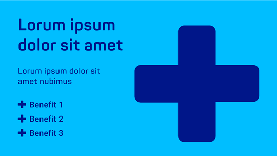
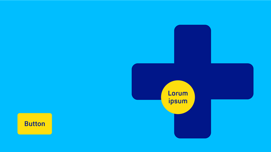
The PLUS is the differentiator that helps us stand out from the crowd and standardize our brand across all categories. It gives all our products and services contextualized meaning and relevance. The PLUS expresses our brand identity and communicative approach. This is also reinforced by a standardized approach to animation, ensuring consistency across all touchpoints.

The PLUS – a core design element for animation

  1. Balanced movement with smooth, fluid transitions. Avoid being overly dynamic or fast, ensuring clarity and a calm, soothing visual experience.
  2. The PLUS maintains flexibility: it can be positioned dynamically but should remain proportionate and recognizable.
  3. Keep text to a minimum: keep headlines short and benefits easy-to-understand.

Transition and Animation

  • Position. The PLUS is flexible and can be placed to the right, left, and bottom bleed of the layout.
  • Motion direction. The PLUS’s flow is smooth and linear, often moving either horizontally or vertically to transition between sections.
  • Movements. Avoid abrupt movements. The PLUS should animate in a calm, deliberate manner to represent trust and expertise. Use around 1 second for the transition.

Best-practice transitions

There are four ways to incorporate the PLUS in animation

  1. Use the PLUS to highlight a specific image area.
  2. Use the PLUS to transition between two instances of real footage.
  3. Use the PLUS to transition from a real image to the blue PLUS.
  4. Use the PLUS to transition between the key visual and additional real image material.

Best-practice transitions are scaling or sliding movements, where the PLUS as a mask can be used ...

... to highlight a specific image area (1)


PLUS frames the key visual, drawing attention to the two people in the shot.

... to transition between two instances of real footage (2)


The video starts with real footage, then the PLUS shifts while the images switch.

... to transition from a real image to the blue PLUS (3)

The video starts with real footage, then the PLUS shrinks and expands to return fully blue.

... to transition between the key visual and additional real image material (4)

The PLUS expands and shrinks while the real footage it frames changes.

Further design elements

In addition to the animation of the PLUS, there are other design elements whose use and implementation are defined.

Benefits & text

Shape of a large blue plus and different text elements on a cyan-colored surface

The design of the benefits is visually defined. Ensure each communication item contains no more than three bullet points. Benefits, or text in general, can enter from the sides or fade in directly but should follow the rhythm of the PLUS’s expansion or transition, syncing with its movement. They should not appear abruptly.

More about the PLUS

Ellipse

The blue ellipse can be used in the following ways:

  • The ellipse has to be used for product communication.
  • Do not use the ellipse for 9x16 social media videos as it overlaps with UI elements!
  • The ellipse may be used in 1x1 and 16x9 formats only on the last slide of the video.

More about the ellipse

Illustration of a blue ellipse with HARTMANN logo, a dark blue plus shape, a URL and a yellow button on a cyan surface

Eye-catchers & buttons

llustration of a dark blue plus shape, a yellow eye-catcher and a yellow button on a cyan surface
  • Eye-catchers can fade and scale in or slide in (vertically/horizontally) and pulse lightly (once).
  • The yellow CTA button appears with a slight bounce.
  • Either a yellow button OR a yellow eye-catcher is used.

More about eye-catchers

Don'ts

  • Not more than one PLUS. If a video has both real footage framed by the PLUS and the blue PLUS, one of the two should always expand, retract, or exit the screen to make room for the other. This should be a continuous motion that feels fluid.
  • Not too much text. Show a maximum of three benefits.
  • No products without the PLUS. Products can only be shown in front of the PLUS, not against full-screen real footage.
  • No changing of the color. If the PLUS is used as a graphic form, without image content, the color is always HARTMANN Dark Blue.

See also

For further information, please get in touch

Please email us at branding.support@hartmann.info