1. Classical communication (sales folders, brochures, flyers)
Option 1
Table filling is white; headlines, title columns, and dividing lines can be HARTMANN Bright Blue, HARTMANN Dark Blue, or gray.
Option 2
Table filling is HARTMANN Bright Blue with 15% opacity. Headlines and title columns are white; dividing lines are HARTMANN Bright Blue.
2. Financial communication (business reports)

Fonts in use
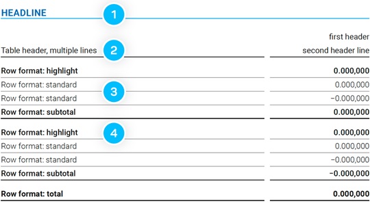
Due to its clear and straightforward form, the Roboto font is used for the table design:
- Headline: Roboto Bold (capital letters), font size 8 pt
- Table header: Roboto Regular, font size 7 pt
- Standard text: Roboto Light, font size 7 pt
- Highlight text: Roboto Medium, font size 7 pt
See also
For further information, please get in touch
HARTMANN branding support
Please email us at branding.support@hartmann.info