Fully flexible measures
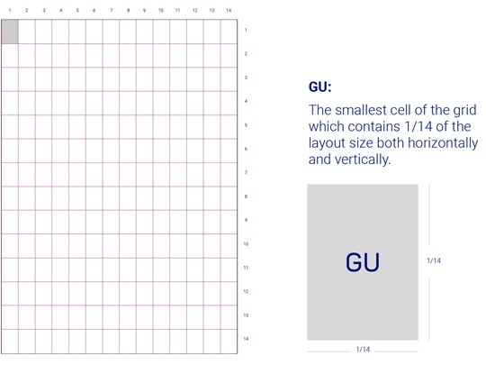
As a fluid concept, the HARTMANN grid follows a flexible and dynamic system that adapts to a variety of layout sizes in both portrait and landscape formats. To create the grid, the layout should be divided horizontally and vertically into 14 fields.
The principles of our grid system
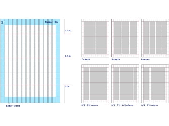
- Margin: The outer GUs must be used as margin.
- Gutter: Gutter width = (1/3 of GU) – (Column width)
- Main flowlines: The 3 base flowlines are crucial to our grid system. They give structure and clarity to layouts.
Top main flowline: 2.5 GU from top
Middle main flowline: 6.5 GU from top
Bottom main flowline: 3 GU from bottom
Grid adaption
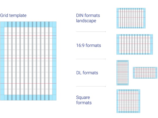
Our fluid grid system adapts to all layout sizes. After downloading, the grid template should be precisely adjusted to match the final layout size.
Note: Lock the grid layer to avoid repositioning it across pages in multipage layouts.
Note: Lock the grid layer to avoid repositioning it across pages in multipage layouts.
HARTMANN brand grid
The HARTMANN brand grid can be downloaded for 6 different formats in the download area. The grids were created with Adobe Illustrator.
Page templates
The page templates show the grid and the various HARTMANN ellipses in use. They are available for Adobe InDesign and Adobe Illustrator.
For further information, get in touch
HARTMANN branding support
Please email us at branding.support@hartmann.info